
Automation
My Own Astro Theme Instead of Hugo and Blowfish - Why I Moved ProHomeLab to a Custom Engine
Also available in: RU
Contents
This is part five of my series on how the ProHomeLab site works. In part one I set up publishing from Obsidian through Forgejo, in part two I moved from my provider's shared hosting to GitHub Pages, in part three I tried squeezing everything into one repository with GitHub Actions, and in part four I gave up on that and went back to two Forgejo repositories.
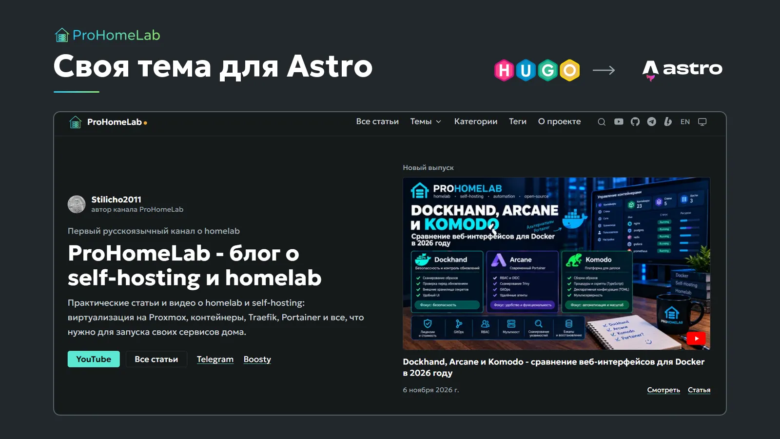
All that time, only the delivery pipeline changed. The site itself stayed on Hugo with the Blowfish theme - I even have a step-by-step install guide for it. Now the site has changed too. Since November 15, 2026, prohomelab.com runs on an Astro theme I built myself.
Article URLs haven't changed, I didn't touch the content in Obsidian, and publishing still starts with a plain push. Nothing changes on that side. I write in Obsidian, the Obsidian Git plugin pushes changes to the content repository on my Forgejo, that kicks off a build in a sibling repository on the same Forgejo, and the result lands on GitHub Pages, which hosts the site.
Below is why I did it, what absolutely couldn't break, how the work went, and what came out of it. In detail, including every snag I hit along the way.
Why I didn't stay on Blowfish
The honest answer sounds a bit childish. I just can't sit still. If something works, I still want to make it better, even though I'm old enough to know that if it ain't broke, you don't fix it. But behind that itch there are some very concrete reasons.
Someone else's theme is always someone else's
Blowfish is a good theme. No - a very good theme. It's fast, it ships a huge set of shortcodes and visual effects, and the docs are decent. But it's someone else's product with someone else's decisions baked in. As long as your site looks like the theme's demo, life is great. The moment you want to do things your own way, you start fighting it.
Before the move I audited my Hugo repository. My own code came to about 1,200 lines, and a good chunk of it was copies of theme files with my changes on top:
| File | What was in it |
|---|---|
layouts/_default/single.html |
a copy of the Blowfish 3.8.0 article template plus a dark strip with a YouTube player above the text |
layouts/partials/schema.html |
a copy of the search-engine markup plus a VideoObject type for videos |
assets/js/code.js |
a copy of the theme script, just to get a different copy-code button |
assets/css/custom.css |
331 lines of my own styles layered over the theme |
Every one of those copies is a time bomb. The theme moved to 3.9.0, while my single.html still carried 3.8.0 logic. Working out what changed upstream and what's now broken on my side is a fresh investigation every single time. On top of that, Hugo templates aren't exactly fun to edit - Go template logic full of dots, with and range is hard to read. And if, like me, you're not a web designer, not a front-end developer, basically a muggle, making it all look good drifts into science fiction.
Every Hugo site looks vaguely the same
The second thing that bugged me was how recognizable it all is. Open ten blogs on Blowfish, PaperMod or Congo, and you'll know what they're built with almost instantly. Header, cards, spacing, typography - all out of the same box. Ready-made themes also draw lines you can't cross without copying their templates.
And now there's a second wave of sameness on top of that - AI-made design. Purple-to-blue gradients, glassy cards, glows, emoji in headings, identical rounded tiles. Once your eye is trained, you can even tell which model made it from the colors and fonts. I'm sick of it, and I definitely didn't want my site looking like that. I'll come back to this later.
My history with Astro themes
This isn't my first time with Astro. Between the first and second Blowfish versions of the site there was a stretch on Astro with the Twilight theme, and before that I'd looked at Fuwari. That era is exactly why some articles still have old URLs that I later had to add to aliases.
The real problem with those themes isn't Astro, it's how they're built. They're starter templates. You clone the theme's repository, and it becomes your site. Theme code, your settings and your content all live in one pile. A theme update comes out - and you have to merge it into your fork by hand, while the update happily, and with a little smack of the lips, overwrites your settings. Both themes are also built primarily for a Chinese audience, and you feel it everywhere, from the fonts to the set of integrations.
So the core requirement for my own theme was clear from day one. The theme has to be a package, like any other dependency, and the site is just a user of that package. The site configures the theme and swaps out individual components when it needs to, but never touches the theme's code. Updating the theme is a plain npm update, not a branch merge.
I want more than a blog
On Hugo, anything more complex than an article is, let's say, a pain in a certain place. And I have plans for interactive things right on the site - I want to build in a calculator for 10-inch racks, for example - plus a separate news section for homelab and self-hosting. Astro has islands for exactly this - interactive components that load their JavaScript only where they're needed, while the rest of the page stays plain HTML.
Not just for me
And finally, I want the theme to be a product of its own that can go up on GitHub and npm for others to build on. Plenty of people write in Obsidian, run a blog in more than one language and fight the same battles I do. So from the start the theme wasn't made "for ProHomeLab" but for any author. The ProHomeLab site is just its first user - if a site can be called a user, of course. If a feature isn't used in my articles but others would need it, it still gets built completely and tested on the demo site.
What Astro is
Astro is an open-source web framework for content-first sites - blogs, documentation, project sites. Like Hugo, it builds the site ahead of time, and what you get are ordinary HTML files you can put on any host. The difference is in how the site itself is made. Hugo is a single Go binary with Go templates, while Astro runs on Node.js, installs through npm, and builds pages out of components. An .astro component looks like an HTML file with JavaScript mixed in, and that JavaScript runs only at build time - it never reaches the browser. Code goes to the browser only when you explicitly ask for it, for example on an interactive block with a client:load or client:visible directive. Those blocks are called islands. You can write an island in Astro itself or in React, Vue or Svelte, and the rest of the page stays static HTML with no extra scripts. You don't need a server either. Astro can render pages on a server on demand, but my site is built fully static and served from GitHub Pages, same as before. If you're curious who else runs on it, take a look at the Astro showcase - there are plenty of big names there.
Why Astro
I could have written my own theme for Hugo too. But I figured that if I'm walking away from someone else's code, I might as well walk away from awkward templates as well. Here's what Astro gives me:
- Components instead of templates. A page's markup, data and styles live in one readable
.astrofile instead of being smeared across partials. - Content collections with a schema. Article front matter is validated at build time. A typo in a date or a link to a missing cover stops the build with a clear error, instead of turning into an image that quietly vanished from the site. And I might never find out about a missing image, because readers don't write in about things like that.
- An integrations API. The theme can be packaged as an integration - a package that adds pages, Markdown processing, types and scripts to the site by itself. That's exactly what a "theme as a package" setup needs.
- Static builds. The output is plain files served from GitHub Pages, the same way Hugo's output used to be. No server.
The work was done on Astro 7.4. Markdown goes through Unified (remark and rehype), because that's where the plugins I need live - for directives and Obsidian wiki links, for example.
What couldn't break
Before writing any code, I made a list of things without which the move made no sense.
URLs. This is the big one. YouTube, Telegram, other sites and search engines all link to my articles. Every engine change I've done before ended with a pile of 404s in Google Search Console. This time not a single public URL was allowed to disappear.
Content from Obsidian, untouched. Articles live in Obsidian and sync to Forgejo, as I described in my post about my process from note to article. Blowfish-style front matter, {{< mermaid >}} and {{< alert >}} shortcodes, ![[...]] embeds, relative image paths - all of it had to work as is, without mass edits, ideally without any edits at all.
Two languages, done properly. A translation is a separate index.en.md file, versions are linked for search engines (hreflang), and the language switcher only points where a translation actually exists.
Everything Blowfish did. Breadcrumbs, a table of contents that highlights the current section, reading progress, series, related posts, tags and categories, search, RSS, sitemap, reading mode, dark mode.
Publishing the same way. Push to the content repository, build in Forgejo Actions, deploy to GitHub Pages.
How the work went
First, the elephant in the room - the thing many will ask about and even more will think.
I'm not a designer or a front-end developer
I can't write front-end code at the level I wanted for the site, and I can't design interfaces. So the theme's code was written by AI assistants - Claude Code and, oddly enough, Codex. I made the decisions, and I checked the results.
Let me be clear up front, so there are no illusions. This was not "hey, make me a website." I already had a finished site with its own design, which I'd spent ages polishing, its own blocks and its own markup, and the job was to move all of it to a new framework without losing anything. I knew exactly how everything worked on Hugo, I knew exactly what I wanted, and, more importantly, what I didn't want under any circumstances. Every step came with a long list of requirements, then review and fixes, then more fixes. Just porting what was essentially a finished theme took more than 24 hours of continuous work with the AI (yes, I timed it), and that's not counting my own reviews and decisions between steps.
To put it bluntly, left unsupervised, AI produces exactly the kind of design that makes me recoil. Ask for "a modern blog site" and you'll get gradients, glows and frosted-glass panels. Claude, for one, loves its native terracotta. On Blowfish my buttons were honey amber, which I think looks great - but who's going to notice the difference? So I kept slapping their hands as hard as I could.
- Fonts and colors only after discussion. No freelancing. The colors come from the ProHomeLab brand book in its "quiet" variant (that's my own internal term) - graphite, neutral links, mint only in small details, gradients only as a thin line, amber only as a dot in the logo. Headings and body text are set in Geologica, code in JetBrains Mono. Unbounded, which used to be on the site and in the logo, is gone completely. It's everywhere right now and looks AI-made on its own, even when no AI was involved.
- No decoration for decoration's sake. No particles, no mascots, no animation on every block, no hero section with a shimmering background.
- Checked against rules, not by eye. Line length, button size, contrast and heading order were checked against accessibility guidelines. For example, the guideline says a line should be 65-75 characters, while I wanted wider text for density. The AI and I settled on a compromise - 79 characters on average. It's a deliberate deviation, not an accident. Or, well, there are no accidents.
- Compared against the old site. Text width, page density and phone behavior were compared with Blowfish by the numbers at different screen widths. That took me a lot of time, especially since my phone has a narrow, tall screen.
The assistants made mistakes along the way, and not obvious ones. Here are two that only surfaced because of the checks. On Windows the file system ignores letter case, so a redirect from the old URL /posts/Name/ silently overwrote the article at /posts/name/ itself. Nine Russian articles vanished that way, and I didn't notice right away - the URL still answered, it just served a redirect instead of the article. After that, the URL check script learned to tell a real article from a redirect page. The other one was the language suggestion. If a reader picked English and then clicked "RU" in the "Other languages" block under the title, they got bounced straight back to English. That one was caught while checking in the browser, before it went live.
That's my main takeaway about working with AI. It speeds up everything except checking. You have to check more, not less. And ironically, you end up spending more time than if you'd done it all yourself (assuming, of course, that you could do it all yourself).
Order of work
The work went in phases, with the riskiest parts checked first:
- Skeleton - the theme package, a single article page, a demo site, the first documentation page.
- Parity with the current site - everything ProHomeLab needs, plus the URL check. No switch-over without it.
- Switch-over - only once the URL check reports zero mismatches, and after I've looked it over myself.
- New stuff - news, interactive tools, link-preview images.
- Public release - GitHub, npm, versioning.
Every decision that had alternatives got its own note with the context, the options and the conclusion. There are thirteen of them so far. Every step is a separate entry in a journal in Obsidian. I'll keep quiet about how much text that adds up to - I think you get a sense of the amount of work. That's my answer to the clickbait videos where an AI builds someone a website in five minutes (and forgets to explain how any of it works). The theme's documentation was written alongside the code, in parallel really, and a feature without a docs page and a demo example didn't count as done. I set myself that rule on day one, because the theme is meant to go public, and nobody wants to dig through undocumented code later, me included.
On the calendar, the first two phases plus the switch-over fit into two days. But behind those two days are more than a full day of non-stop AI work and dozens of "requirements, result, review, fixes" loops on my side. I'd make a joke about being a meat proxy, but I'm the one who set the task, too. The only fast part here is that the assistant doesn't get tired - the usage limits do. Deciding, checking and sending things back for rework was all on me, and boy, is it exhausting.
The URL check
This is the most useful part of the whole move, and it deserves its own section.
I didn't trust the sitemap. It leaves out tag pages, redirects from old URLs and RSS feeds. Instead, I built the whole Hugo site into a temporary folder on Windows and turned the output into a complete list of URLs with their types. That came to 1,338 URLs. Even I was surprised.
Here's how it broke down. 702 of them are Hugo by-products that nothing links to:
- an automatic
/page/1/redirect for every list and every tag - 348 of them - a separate RSS feed for every section and tag - 352
- the Blowfish search index
index.json- 2
I decided not to reproduce those. That left 636 public URLs that actually get used - articles, sections, tag, category and series pages, the main feeds, the sitemap, robots.txt, and 76 old URLs from aliases that have to point to the new ones.
The check script makes sure the new build serves every one of the 636 URLs, and that an article is an actual article, not a redirect. If anything is missing, the script exits with an error. The same script now runs in the Forgejo build, so the site won't publish if a URL goes missing, and I immediately know where I messed up. Or where someone else did. The number of mismatches was the main progress metric for that phase, and the switch-over only started when it hit zero.
The safety net is the 404 report in Search Console. If one of the dropped URLs turns out to matter to someone, it'll show up there, I'll see it and add it to aliases.
What I ended up with
The theme does everything Blowfish did on my site, and a bit more. Here's what readers can see.
Articles. A cover or a YouTube video above the text, a table of contents that highlights the current section, reading progress, series, related posts, previous and next, share buttons, reading mode, an author box. On wide screens, tables and screenshots spill out of the text column into the free space, while the text itself stays at a comfortable width.
Lists and taxonomies. "All articles" grouped by year, sections from folders, pinned posts, tags, categories, series, author pages. Tag URLs follow the same rules as Hugo, so they matched without any manual work.
Markup. Blowfish shortcodes work as is (and remember, this is a different framework), and each one also has a second syntax for new content. Obsidian- and GitHub-style callouts, math, Mermaid diagrams, Obsidian embeds, repository cards, galleries, tabs, steps.
Search. Pagefind, a separate index per language, no server. Open it with the button in the header or the / key.
Languages. If your browser isn't set to Russian (I count Ukrainian, Belarusian and Kazakh as Russian too, since readers there usually read Russian), a strip appears at the top saying "This page is available in English", with buttons. Nobody gets redirected automatically - that's Google's recommendation. Your choice is remembered. The analytics banner speaks your language too.
A 404 page in both languages, suggesting similar articles based on the words in the broken URL.
View counts. View counts and likes used to run on Firebase. I dropped Firebase and the likes. That was a whim - back when I was starting out, I somehow thought it was a useful bit of eye candy. I've grown up and realized I don't need it. View counts now come from my self-hosted Umami on every build and are written straight into the pages, so your browser doesn't go anywhere to fetch them. The downside is that my Umami has only been running since October 2026, so the numbers are lower than before.
Just in case, for the especially curious. My Umami's own address never shows up on the site. Your browser loads the tracker from stats.prohomelab.com, which is a Cloudflare Worker - more on that below. The internal address the build uses to fetch view counts only lives in the build settings, too.
Consent-based analytics. Yandex Metrica, Google Analytics and Umami don't load until you click "Accept". Both buttons, "Accept" and "Decline", look exactly the same, so nobody gets nudged into agreeing. I don't do that kind of thing.
Phone first. Styles are written for narrow screens and expand for wide ones. At 360 px no page scrolls sideways, and buttons are at least 44 px. Every feature was checked on a phone and on a desktop before it counted as done. Then again, who am I kidding? I'm still catching small bugs.
How articles get published now
The flow is the same as in part four, only the players changed.
- I write an article in Obsidian, and Obsidian Git pushes it to the content repository on Forgejo
- A small workflow in the content repository calls the build in the site repository through the API
- The build on the Forgejo runner pulls the site, the theme and the articles, installs dependencies with
npm ci, builds the site, fetches view counts from Umami and checks all 636 URLs - If everything's fine, the folder with the finished site goes to the
gh-pagesbranch of a new GitHub repository, and GitHub Pages serves it on prohomelab.com
A clean build takes a little over two minutes.
Along the way there were a few moments that were interesting and educational, at least for me.
Umami behind Authentik. The public address of my Umami sits behind Authentik, with only the tracking script and the stats endpoint left open - without them the counter simply wouldn't work for readers. The build, trying to log in to the Umami API, got the Authentik login page instead of an answer. I don't want to expose the API to the outside world. So the build talks to Umami over its internal address, bypassing the proxy, and that address lives in a Forgejo variable. Umami got a separate user with view-only rights for this.
The firewall. The next attempt failed with fetch failed. The runner and Umami live on different subnets with rules between them. Ping went through, but connections to the port were dropped. One rule fixed it - the runner is allowed to reach a single Umami port, and nothing else.
A separate address for the tracker. Your browser loads the tracking script directly, so its address is visible in the source of any page. It used to be my Umami's own domain, and I didn't want that out in the open. Now a tiny Cloudflare Worker on stats.prohomelab.com sits between the site and Umami. It lets exactly five paths through - the two scripts, the page-view endpoint, the session-recording endpoint and its settings - and answers 404 to everything else, the dashboard login included. The Worker hands the reader's address to Umami in a separate header, but only for two things - looking up the country and city in Umami's own GeoLite database, and telling one visit from another. Umami doesn't store the IP itself (its database doesn't even have a field for it) and never shows it to me; all I see in the stats is the country, city, browser and device. Without that header, every visitor would appear to be wherever the Worker happens to run. Cloudflare's free tier covers this with room to spare. I tested it with a visit from my phone - it showed up in Umami right away, with the correct country, the one the phone was actually connecting from.
First runs without publishing. The deploy-to-GitHub step only kicks in once a target repository is configured. The first runs on the real runner built and checked the site without touching the live one. I highly recommend doing this for any migration.
Switching the domain
The move itself took a few minutes. What mattered was the order.
First I redirected the build. The old Hugo build pushed a CNAME file with my domain to the old repository on every new article. If it had fired after the move, GitHub could have handed the domain back to the old repository. So first the workflow in the content repository started calling the new build, and only then did I move the domain.
Moving it in GitHub Pages means removing the domain in the old repository's settings and entering it in the new one. No DNS changes needed, since both repositories belong to the same account. The certificate was issued right away. Articles started loading from the new site almost instantly, while the home page kept coming from GitHub's CDN cache for a few more minutes.
After the move, the script walked through all 636 URLs on the live domain. Every one answered.
I'm not deleting the old build or the old repository yet. Rolling back means moving the domain back and reverting one line in the workflow - a couple of minutes' work. In a few weeks, once it's clear I won't need it, the old site will be shut down for good.
What isn't perfect
It wouldn't be honest to end on the good parts only.
- The theme isn't published yet. It lives in my private Forgejo. A public release on GitHub and npm is a separate phase, and until then the theme isn't ready for other people's sites.
- The documentation is English-only. There's no Russian version apart from the home page. No offense to anyone, but I don't see the point of Russian docs yet, even though, for obvious reasons, they'd be easier for me to write.
- Publishing under a subfolder isn't supported. The site has to live at the root of a domain. An address like
user.github.io/repo/doesn't work yet. - Lines are longer than recommended. 79 characters on average instead of the recommended 65-75. That's my call, for density. I'm still not a hundred percent sure about it.
- Long tables on phones. A table scrolls inside its own frame, but the header row disappears as you scroll down. Pinning it is a separate task.
- View counts started over. The Firebase history wasn't carried over; counting starts from when Umami was installed. That matters more to me, or to potential advertisers who may or may not show up someday.
What's next
The next phase is what all this was for. A news section, interactive tools like the rack calculator, automatically generated link-preview images. After that, a public release of the theme with documentation.
If you run a blog from Obsidian on Hugo and you're thinking about a similar move, the main thing I'd recommend is this - start with your list of URLs, not with the design. A pretty site with a pile of 404s in Search Console is a bad trade. And in general, looks at the expense of function never end well - I learned that one the hard way.
Related articles

ProHomelab - Automating Article Publishing via Forgejo
Fully automating ProHomeLab publishing: I write an article in Obsidian, the changes automatically land in Forgejo, Forgejo Actions triggers a Hugo build on a Blowfish LXC, and the finished site gets uploaded with no manual steps at all.

When Simpler Doesn't Mean Better - Going Back to Two Forgejo Repositories
Why self-hosted GitHub Actions on a single repository (article 3) turned out not to be the choice worth keeping - and how I reverted back to the proven two-repository Forgejo setup, walking through an honest comparison of both options along the way.

Removing the Middleman - Migrating from My Own Forgejo Runner to Self-Hosted GitHub Actions
How I moved the build and deploy of ProHomelab from a homemade Forgejo runner to a self-hosted GitHub Actions runner on my own LXC, merged content and site into a single repository - and what didn't go according to plan.